


As we head into autumn, it’s time to start looking forward to the kitchen trends that will step into the fore in 2026, and more importantly, the ones we’re leaving behind. When it comes to kitchen colour schemes, knowing which shades won’t be in style in 2026 will help you make the right decision well ahead of time, so you stay in love with your chosen hues for longer.
Kitchen colour trends naturally and slowly evolve from year to year. It is unlikely to be too much surprise about a new entry, or exit, and so these three shades might not shock you, but it is a sign that their slow decline in popularity has almost concluded.
So with no further ado, here are three shades to steer clear of if you’re looking to create a stylish and trend-focused kitchen colour scheme in 2026, according to design experts.
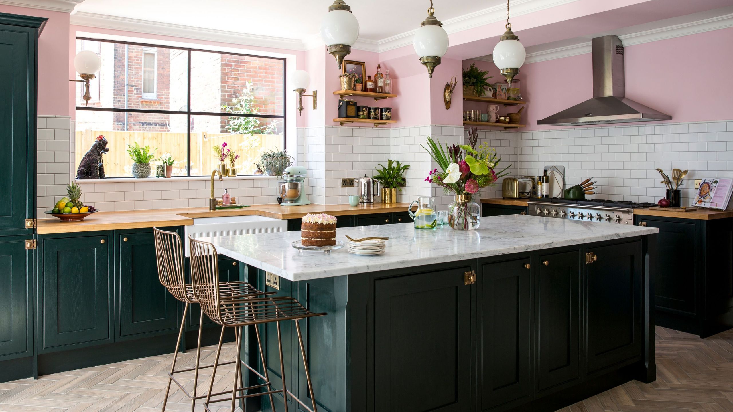
1. Dark green
Dark green kitchen ideas have been slowing down in terms of popularity for some time now, but as of 2026, they’re officially out.
‘I think we’ll start to see deep forest greens, once the go-to statement shade for kitchens, begin to feel a little overdone as we move into 2026,’ explains Carina Raymond, interior designer & founder of Studio Raymond.
‘They’ve had a brilliant run, but the mood is definitely shifting towards something softer and more grounded. Earthier tones are taking their place, warm putty, clay, chalky taupe, stone and buttery creams and pinks – colours that bring a more natural, timeless quality to kitchen design.’
This isn’t to say that dark, statement shades are a complete no-go. There’s still a place for them, but it will look more like deep red and brown hues.
2. Navy
Navy kitchen ideas have often felt like a kitchen failsafe. A dramatic colour, yes, but one that sheer popularity has made accessible and easy to decorate with. But is it on its way out?
‘What I’m really seeing now with my clients is this big move away from those cooler tones,’ explains Tash Bradley, director of interior design at Lick.
‘Navy blue has been a go-to for kitchens for the last few years, and for good reason: it’s timeless, grounding and sophisticated. But with many people craving more warmth and light in their homes, a navy can often feel quite heavy and cool.’
While pale blue still has cool undertones, when paired with oak worktops or accessories with tonnes of texture, it actually creates a homely and inviting atmosphere that is set to take over navy’s reign.
3. Butter yellow
Butter yellow only crept onto the scene this year, and it might be a short-lived trend cycle. While pastel shades have technically been popular for decades, particularly in Shaker kitchens, the buttery hue might be one to leave behind.
‘Even butter yellow, which has had such a lovely moment in 2025, will start to evolve, I think we’ll see it used in softer, chalkier ways rather than as a statement tone,’ explains interior designer, Laura Stephens.
‘Overall, kitchens are becoming warmer and more natural again. The next wave of colour will be about gentle earthy tones, subtle greens, soft plaster pinks and neutrals that feel uplifting but calm. It’s less about making a bold colour statement and more about creating spaces that feel timeless and homely.’
Kitchen paint colours to try instead
Farrow & Ball Estate Setting plaster Matt Emulsion paint, 2.5L
If you want a pink that isn’t too pink (maybe it’s been hard to convince the family), then setting plaster is by far your best choice.
Somewhere in between green, brown and grey, this olive-y hue from Lick will fit the ‘earthy’ trend brief.
Farrow & Ball ‘Paean Black’
Don’t let the name deceive you – Paean Black is actually a rich aubergine shade that has been declared the colour of the season for autumn/winter 2025.
Do you agree with this list or do you have strong feelings about one of the colours on its way out?
Read the full article here


