


When Amy and John moved into their north London Victorian terrace ten years ago, their daughter was just three months old.
‘We did some light refurbishments early on,’ Amy says, ‘but we always knew the kitchen would need more attention one day.’ That day came 18 months ago, when the family decided to unlock the potential of the dark and disconnected layout.
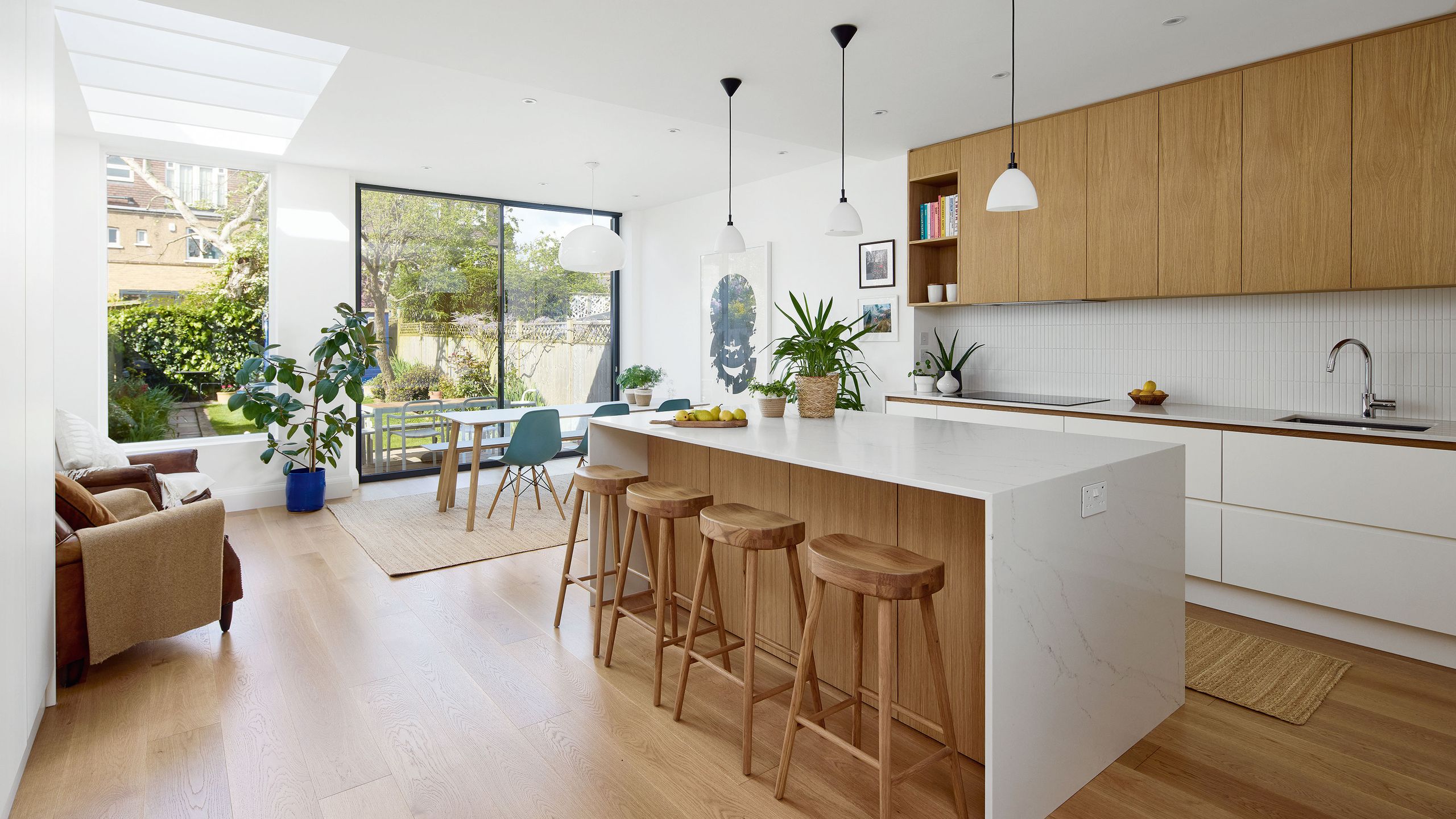
The existing kitchen had once been extended into a conservatory-like structure at the rear, but the interior walls had remained intact. ‘It meant the kitchen and dining space ended up in the middle of the house, where it was dark and awkward,’ Amy says.
To reimagine the space, they enlisted the help of Maria from Ohma Studio.
‘I’d worked with Maria before and knew she’d be incredible – super pragmatic, great with budgets and very aligned with our style,’ says Amy. ‘She’d say, “Spend money here, save money there.” Like, go for an expensive cheap floor, not a cheap expensive one!’
The new layout opened up the back of the house to the garden with picture windows and dual sliding doors, while creating a snug at the front of the house.
‘As the kids got older, we found we wanted more zones; a space where they could hang out, and a quieter space for us.’
The layout has been broken down into zones. ‘I love all the different areas we have now. There’s the island, where the kids sit and draw, a seating area for us to relax in the evening, and the dining table where we all come together.’
Inside, zones flow together naturally – a central island, a small seating nook and a spacious dining area.
‘We can all be in the same room, doing different things – drawing, chatting, cooking – but it doesn’t feel cluttered.’
While the space is now light-filled and expansive, the design remains calm and considered.
‘I didn’t want bold units or walls,’ says Amy. ‘I’ve got enough stuff to bring personality. I wanted the space to act as a blank canvas.’
Custom-built kitchen units, painted in a soft white, were designed to run floor to ceiling. The interiors are lined with oak veneer to bring warmth. ‘It gives the appearance of solid wood without the cost,’ Amy notes.
The kitchen features thoughtful touches such as under-shelf lighting, the utility room hidden behind cabinets and drawers instead of cupboards to keep things accessible.
‘We’ve got a lot of stuff – keys, hair clips, school things – so having places to hide it all has been life-changing. Now it feels harmonious. Simple lines, warm tones, and space to add colour through the things we love.’
Read the full article here


