


 things to clean before going on holiday")


Small appliances, like kettles and toasters, always seem like quick need-not-want purchases, but why is this the case when they live on our worktops year round?
It pays off to spend some time researching the best kettles and the best toasters that will make those small daily habits run seamlessly, and choosing the right colour for a kettle and toaster comes into that decision.
But what colour should you go for? From classic stainless steel options to retro-inspired pastel hues, these are the shades people always run to for their small appliances, with the latest kitchen trends in mind.


Over the last few years, we’ve seen more and more colours appear within kitchen appliances. It signifies a larger shift in our homes as we embrace playful colour expression even more, and enjoy the wellbeing benefits that a colourful home provides.
While our cabinets and walls got the memo a while ago, it naturally took a little longer for appliances to catch up. Large appliances, like our ovens, fridges and microwaves are typically in stainless steel, so small appliances followed suit.
‘Stainless steel is a consistent, timeless seller in kettles and toasters as it is most compatible with a lot of kitchens,’ explains Saul Davies, Buying Director at Salter. However, as appliances themselves got more ambitious (from slushie machines to air fryers), so did the colours of them.
When it comes to kettle and toaster colours, pastel shades have reigned supreme as the alternative option to stainless steel.
‘Creams or warm neutrals still perform well as they tend to soften kitchens and are not harsh against fixtures such as brass, silver or gold. We are seeing a demand in pastel or brighter, bolder colours which are mainly shopped by style-led consumers. Our Retro is range we have seen huge success with pink being one of our best-selling colours,’ Saul adds.
Cream, pale blue, pink and green shades have been the classic choice for a kettle and toaster, and particularly suit heritage Shaker kitchens where you want to avoid too much stainless steel.
However, in 2026, neutral hues that offer something different to white and cream are rising in popularity.
Softer neutrals, such as beige and earthy green hues, offer a new perspective on kettle and toaster shades. If cream feels too stark for your kitchen, a more subdued shade might be best.
‘Sage and olive green is our fastest growing colour and is highly popular over the last 12 months. It is seen to the consumer as a new neutral addition that adds colour without being too risky,’ explains Saul.
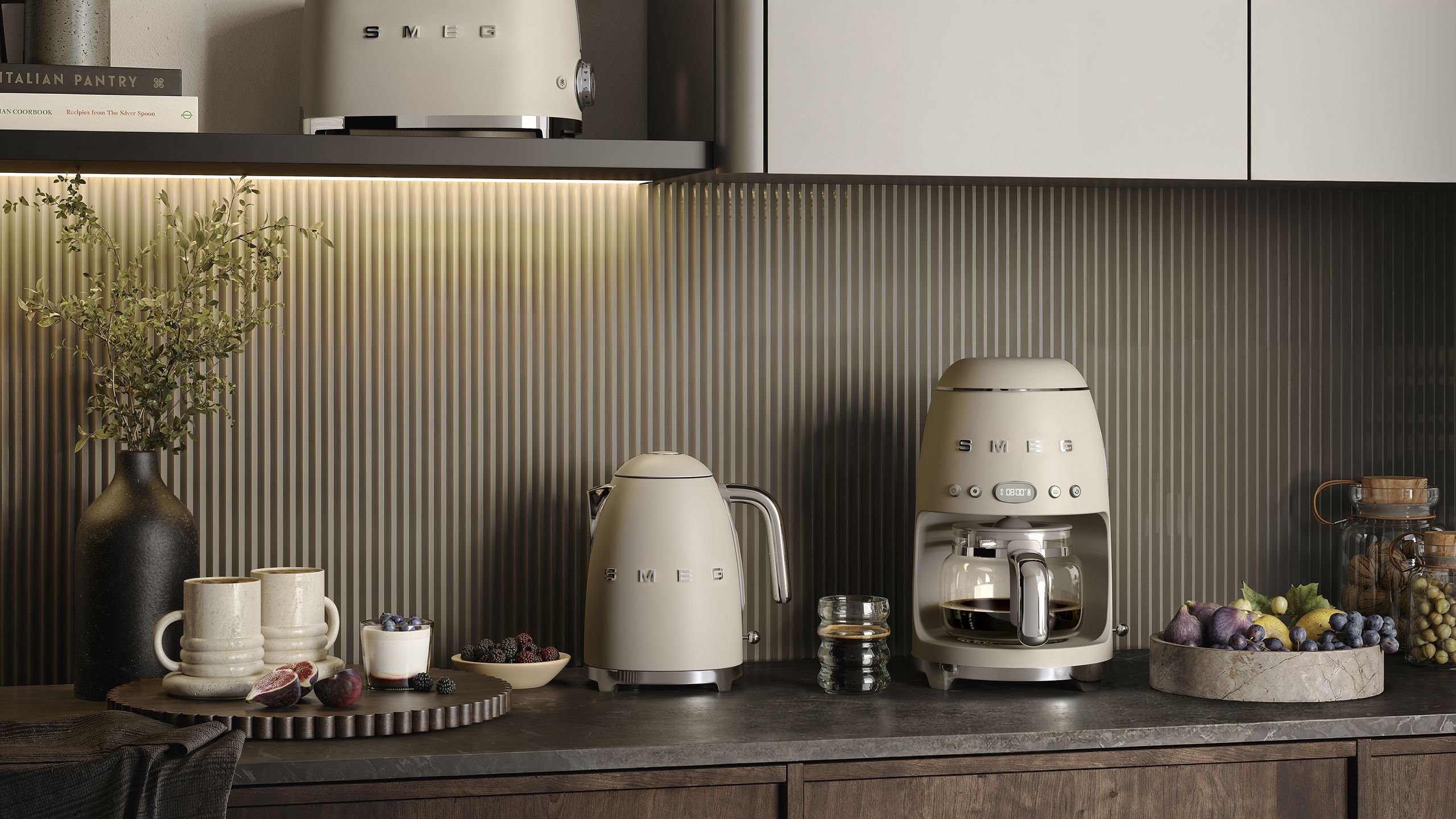
This is also reflected in Smeg’s new matte Moonlight collection – a matte, beige version of their famous retro kettle style that has a much more contemporary look.
‘Inspired by the growing popularity of softer, nature-led palettes, the shade brings warmth and tranquillity to the kitchen while complementing the brand’s iconic design,’ says Niamh Griffiths, senior marketing executive (SDA) at Smeg.
‘The muted neutral tone reflects a broader interiors shift towards calm, wellness-inspired spaces and understated luxury, making it an ideal choice for consumers looking to create a kitchen that feels both timeless and contemporary,’ she adds.
In 2026, sleek stainless steel kettles are remaining a popular and timeless choice, but as we look towards colour to shape our interiors, reflecting these careful choices in our small appliances is just as important.
Shop kettles and toasters
Salter
Salter Ripple Rapid Boil Kettle
If you prefer a traditional style, this sage green Salter kettle will add colour without being kitsch.
Salter
Salter Toronto 1.7 L Kettle
The combination of the earthy green shade and wooden handles make this kettle more of an art piece than an appliance.
Sage
Sage Soft Top Kettle, 1.7l, Damson Blue
If you like your appliances sleek and modern, this Sage kettle has a contemporary look without being too harsh.
Smeg
Smeg Klf03 Electric Kettle, 1.7l, Slate Grey
Smeg’s retro kettle is instantly recognisable – this new colour gives it a fresh lease of life.
John Lewis
Smeg Tsf01 2-Slice Toaster, White
It’s only right to have your toaster and kettle match – this is a combo made in heaven.
Smeg
Smeg Dcf02 Drip Filter Coffee Machine, Cream
Why not extend this colour scheme to your coffee machine too? It will create a cohesive look on your kitchen worktop.
In 2026, sleek stainless steel kettles are remaining a popular and timeless choice, but as we look towards colour to shape our interiors, reflecting these careful choices in our small appliances is just as important.
If you enjoyed reading this, sign up for the Ideal Home newsletter for all the latest home decor trends and inspiration delivered straight to your inbox
Read the full article here


