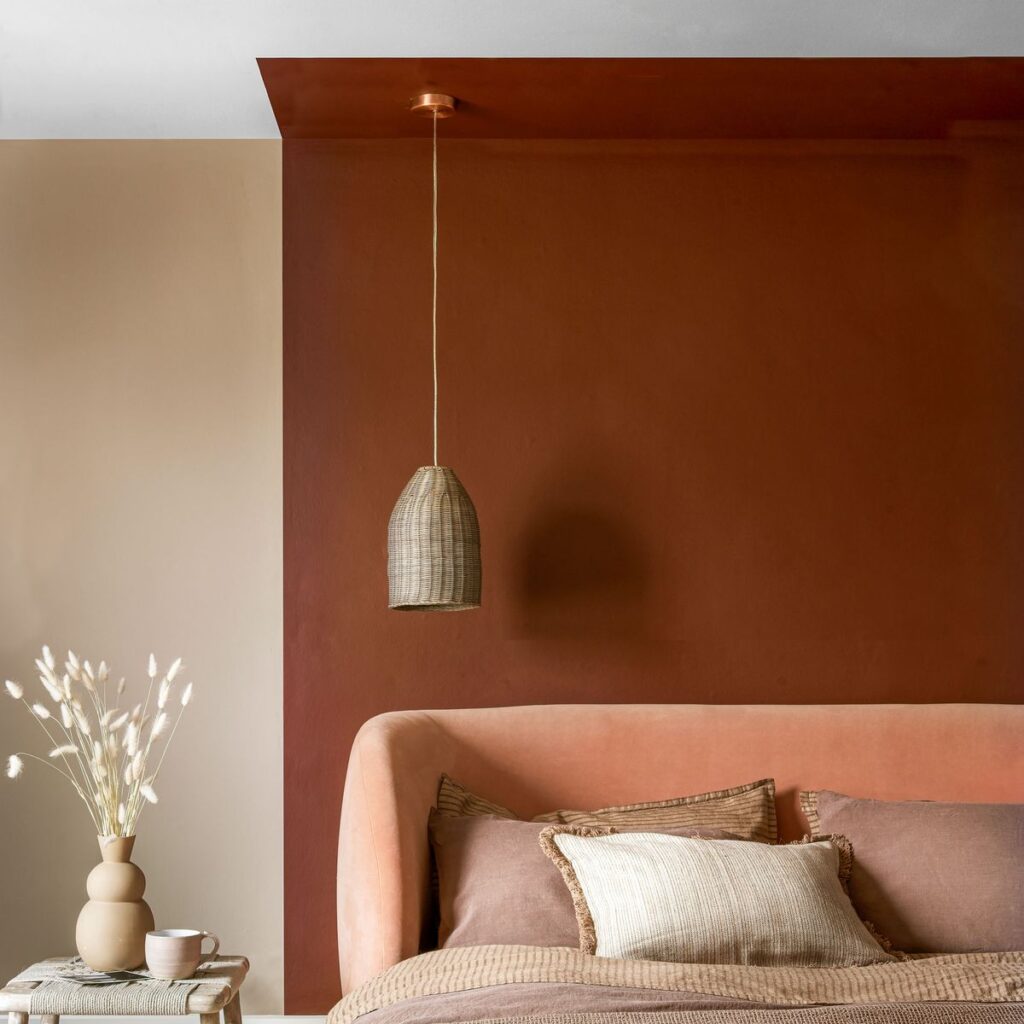
Potters Clay is the go-to colour for homes and interiors in 2025, according to research by Not On The Highstreet.
Rich earthy terracotta tones were one of the biggest paint trends this year and we’re pleased to hear this trend is continuing into 2025’s colour palette.
The trend is inspired by the paint shade Benjamin Moore’s Potters Clay it is a sunbaked terracotta orange, packed with warmth and is a great example of the earthy shade. This colour trend has a rustic appeal and it’s easy to see why it’s going to see why it’s going to be popular.
‘The undisputed interior shade for 2025 is set to be ‘Potter’s Clay’, with 2,900 Pinterest impressions in just seven days,’ says Melanie Menczykowski, trend forecaster at Not On The Highstreet.
‘The warm, earthy tones of Terracotta have surged in popularity this year as customers increasingly seek natural materials and timeless, artisan homeware. Combined with the popularity of sandstone, these two shades blend to create 2025’s ‘it’ shade. This inviting hue brings a sense of grounding and authenticity to interiors, perfectly aligning with the desire for more organic and enduring design.’
The colourway has a timeless, natural look to it, which is a huge part of its appeal. And it’s definitely proving popular – just take Angela Scanlon’s Womb Room for Inspiration.
‘It strikes the perfect balance between timeless appeal and the boldness needed to make a statement in modern spaces,’ says Jethro Huie, founder of Huie Designs.
‘It is softer and more sophisticated than darker browns while offering a muted richness that feels more contemporary than traditional terracotta. Its subtle depth makes it a perfect statement shade.’
How to add potters clay to your home
Following colour trends is a fun way to keep your house updated. But sometimes stripping back wallpaper and whipping out the paintbrushes isn’t always practical especially given how quickly some trend circles move.
Instead, furnishing your home with Potter’s Clay-hued home accessories is a stylish and affordable way to keep up with 2025’s ‘it’ colour without making any drastic changes.
‘It works beautifully as a statement wall colour, on furniture, or in accents. Pair it with soft neutrals, natural textures like jute or linen, and complementary tones such as sage green, cream, or charcoal for a modern, balanced look,’ recommends Jethro.
Potters clay accessories edit
Elements Butterscotch Ceramic Vase
This and glossy vase is contemporary and modern whilst retaining it’s rustic charm.
DytÅg Cushion Cover – Red-Brown 50×50 Cm
Made of washed linen, this material has a casual and effortless feel.
Hand Woven Recycled Polyester Outdoor Rug
The rug has a Cowboycore aesthetic, which we love. The colourway pairs perfectly with a woven texture for a western feel.
Habitat Terracotta Small Planter – Orange
Take your houseplants to the next level with this stylish pot. The white add to it’s rustic appeal.
Phuket Recycled Velvet Rattan Lamp Shade
Potters Clay works really with textured materials such as rattan. This shade combines shape and texture to create a truly beautiful shade.
Sage green pairs really well with the orange shades of Potters Clay. Add dried flowers to this vase for a subtle yet effective look.
Potters Clay has a warming, welcoming appeal to it which can in turn give your home the same feeling. Using a pop of this soft shade through your cushion vases are even an effective way to add a dose of warmth to your space.
Will you be injecting this rustic hue into your home this winter?
Read the full article here

