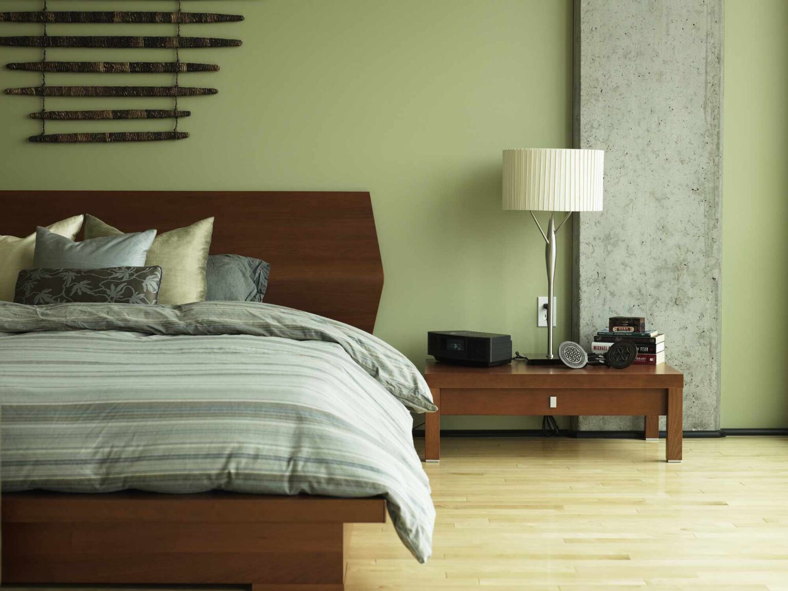
When it comes to bedding, you’ll want to keep more than just function top of mind. After all, there are so many different routes you can go when it comes to both color and pattern. If you’re looking for a bit of guidance as you decorate your home with the year 2026 top of mind, interior designers say that certain bedding shades and designs are on their way out of style, and you’re better off avoiding them in your space.
Here, three professionals weigh in with comments on some of the bedding styles that they don’t foresee sticking around for long and why. Making an effort to avoid these five particular looks will ensure that your home looks as contemporary and stylish as possible.
Gray and White
It’s time to move on from these simple hues, Meghan Jay, the founder of Meghan Jay Design, says. Jay explains how the hues feel a bit sterile and are on their way out in the new year. These two shades can also make a room feel cold and dull.
Instead, the designer recommends thinking outside the box. She notes that we can expect to see brighter colors such as terra-cotta and burnt orange make a splash in the bedrooms of 2026. Try adding these vibrant shades through small accent pieces if you aren’t completely sure.
Wang Yukun / Getty Images
Want more design inspiration? Sign up for our free daily newsletter for the latest decor ideas, designer tips, and more!
Matching, Monochromatic Sets
Another thing to steer clear of is going all in with pillows, blankets, and sheets in the same shade. Instead, switch things up with other colors since monochromatic palettes aren’t popular anymore when it comes to bedding.
“People are more eager to create a casual and eclectic look by mixing patterns and colors,” Jay says.
Dijana Savic-Jambert, the co-founder of Maredi Design, agrees that mixing various colors is going to become more popular next year.
“Matching sets are definitely going to be a thing of the past,” she says. “There is a much more intentional and curated effect that comes from carefully selecting each piece of bedding to dress the space.”
Ryan McVay / Getty Images
Earth Tones
Deep and rich colors including spruce, brick or persimmon, and navy may seem like a great way to warm up a room, but Jill Litner Kaplan, the founder of Jill Litner Kaplan Interiors, advises against choosing bedding in these hues.
These shades, she says, “feel too heavy, moody, and like it’s fall every day.” She urges people to opt for colors that appear a bit more seamless and timeless instead.
Can’t resist incorporating colors of this nature into your sleep space? Kaplan offers a viable solution.
“Rather than doing dark and edgy colors in the bedding, one can also paint or paper the walls in a deep shade and do a more neutral bedding so that the room feels balanced,” she says.
Pattern-Heavy Pieces
Again, regardless of what colors speak to you, be mindful to select bedding that isn’t full of super busy patterns, or else, it can end up overwhelming your space.
More simplistic patterns will instead reign supreme, Savic-Jambert says, explaining that accent pieces with classic and subdued patterns will be the winners.
Kaplan agrees and recommends adding a bolster pillow on the bed or throw pillows in a patterned fabric that ties in with the other colors in the room to keep everything cohesive.
Katarzyna Bialasiewicz / Getty Images
Formal Patterns
On the note of patterns, be sure to move away from patterned designs that look too formal and may end up dating your space. If you like a vintage-inspired look, note that you can most definitely still enjoy classic prints including florals and checks, Jay shares.
Just make sure to incorporate them so that they read 2026, not 1926.
“These prints are being reinterpreted in a more modern way.” Jay adds, “These patterns feel lighter and more casual, creating a refreshing bedding look.”
Read the full article here
