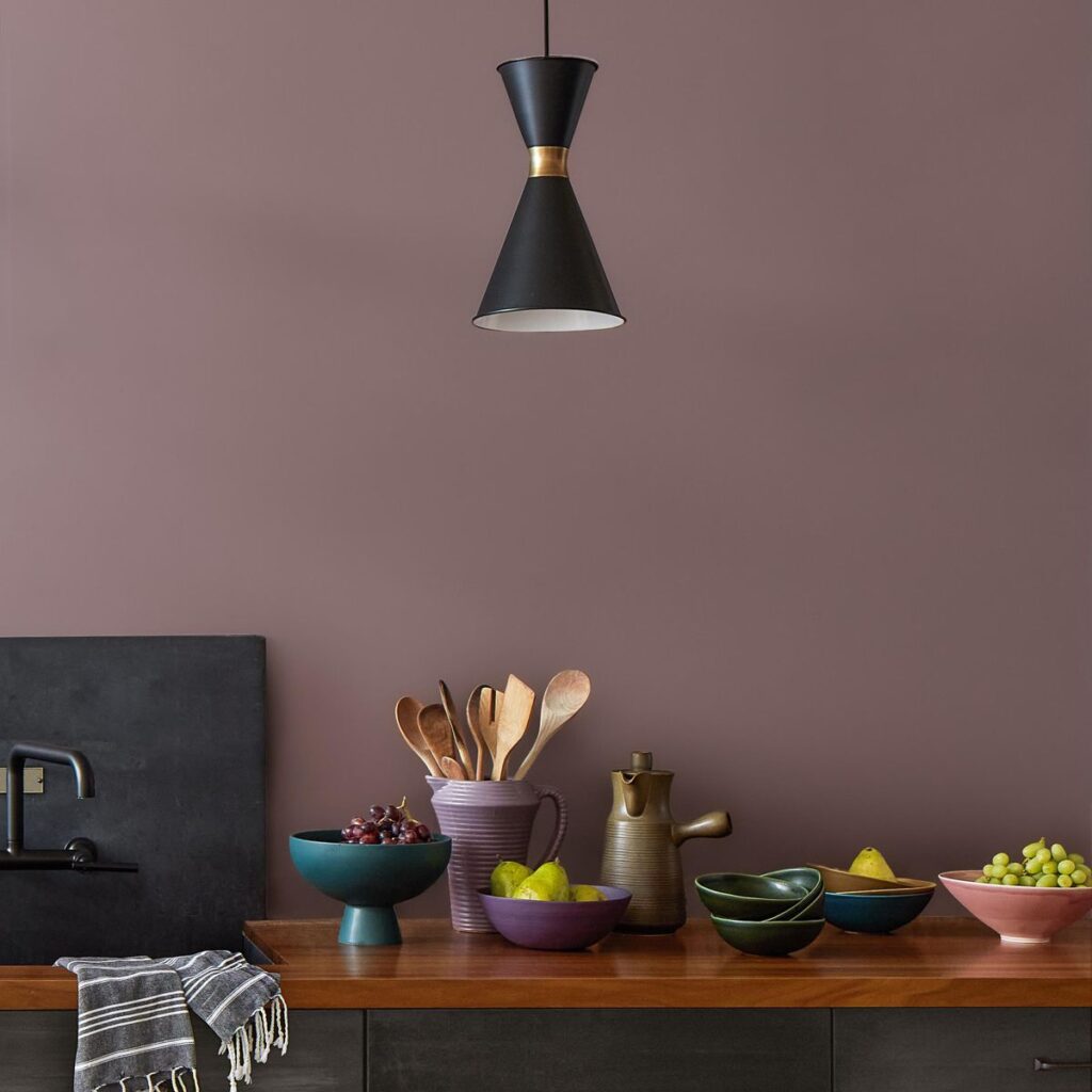
This is the time of year we get to see the colours experts make their predictions of what they believe will be big news in 2025, and earlier this week I got a sneak peek at the colour being championed by one of our favourite paint brands, Benjamin Moore.
I’m pleased to report that their Colour of the Year 2025 did not disappoint and has made me excited to begin experimenting with the latest paint trends. Described as a ‘mix of heathered plum and velvety brown’ Cinnamon Slate is a sophisticated colour with rich, earthy undertones. The star of a Colour Trends 2025 palette made up of nine other hues, ranging from neutrals to moodier tones, the colours are all designed to work harmoniously together.
Helen Shaw, director of marketing (International) at Benjamin Moore coins the term ‘in-between colours’ to sum up the collection. But exactly does she mean by ‘in-between’?
Let’s take the hero colour, Cinnamon Slate, as an example. It sits somewhere between purple and brown (it also shows touches of burgundy and grey) and will change depending on the lighting conditions and other textures and colours in the room. Sometimes it’ll lean towards more purple, and other times more brown. making it really versatile and usable.
‘To us, an in-between hue is a more subtle and comforting take on colour that provides presence in a room without distraction,’ says Helen. ‘These nuanced hues still embrace saturated colour but move away from the vibrant hues that have proven most popular in recent years. Thanks to layered undertones an ‘in between’ colour is more muted and doesn’t sit firmly in one colour category or another.’
What does that mean for our homes? It offers us the perfect balance of interest and permanence – and it’s perfect if you want colours that will lend an air of laid-back luxe that’s super easy to live with.
‘When it comes to trends, we’re always talking about evolution rather than revolution So when you look at the previous year’s palette, it’s a move on from those colours. We had a lilic tone in the previous palette but it wasn’t this saturated. A lot of this year’s colours are quite bold.’
While the colours in Benjamin Moore’s wider Colour Trends 2025 palette are bold, I see them as a different take on bold. Rather than ‘in your face’ hues, this palette is all about depth and richness, and they speak to the ongoing trend towards earthier hues – brown, ochre, terracotta.
I described them as ‘gentle bold’ when I first saw them. These colours will make a statement in your home, but it’ll do it with a relaxed confidence, rather than shouting from the rooftops.
The softer edges to the colours make them feel organic, and rooted in nature which creates a sense of balance and tranquility. And they all have an underlying warmth, even when they’re colours you would traditionally consider cool, such as blue (look at the stunning green blue tones of ‘Stained Glass’).
For me, the other stand-out feature of this colour palette is how harmonious it feels. ‘The idea is that it’s a helpful home palette, so you can use it throughout your home,’ says Helen. ‘They work together beautiful and have a lovely flow.’
A serial redecorator, I’ve personally always struggled with building a palette that works across all the various spaces in my whole home. I love playing with different colours, but ultimately want the overall look to seem considered and cohesive. I am inspired by how easy these 2025 hues will make that to achieve.
Colour drenching is still a key paint trend, and now we’re seeing the arrival of double drenching (combining two related colours but with different undertones), so it’s clear that finding new ways to envelop ourselves in colour has a lot of appeal.
These Benjamin Moore hues are perfectly designed for that, whether you’re pairing the two greens – Ashwood Moss and Rosepine – or mix and matching Chowning’s Tan (my personal fave) with the more delicate Tissue Pink.
So will you be decorating with Cinnamon Slate this year? Browse the full range online and be ready to feel inspired to pick up a paintbrush immediately!
Read the full article here

