- Dark hues like black, deep blue, and dark green are all elegant and can be styled with lighter grout and decor.
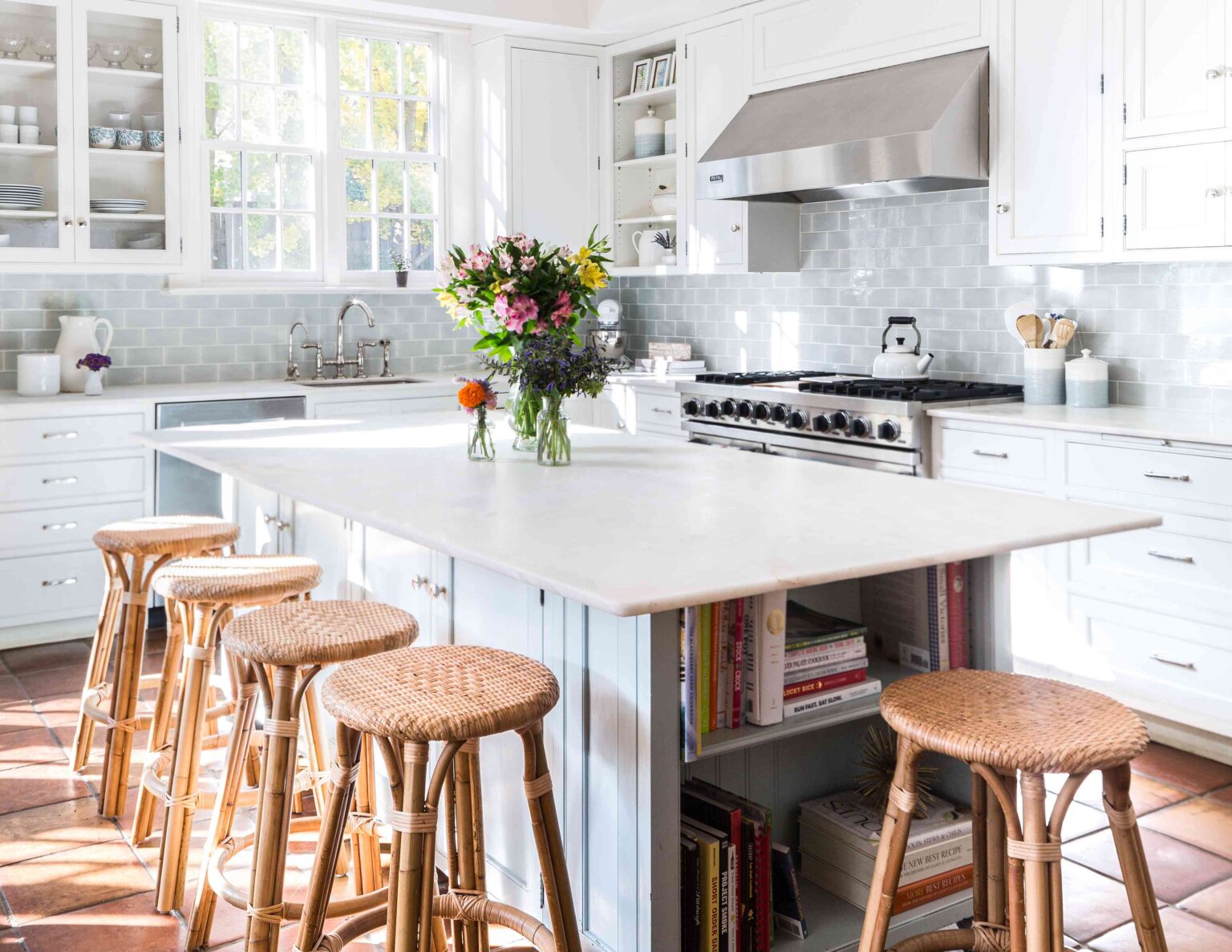
- Opt for neutral tiles like light taupe and cream in various shapes to create visual interest in the space that feels airy.
- For a dose of personality and color, choose light orange or even terracotta to make a joyful yet subtle statement.
As textiles are heavily used in home renovations since they bring texture and depth to a space, it’s important to keep up to date with which colors will actually withstand against trends in the coming years. We asked two interior designers to share what tile colors they love to use and why, to give you some inspiration as you plan your next kitchen, bath, or other tiled-space remodel.
Green
From paint colors to tile tones, green has seen a revival in the last ten or so years, thanks to the increased popularity of biophilic design, which is nature-inspired and can enhance wellness and a general desire to bring the outdoors in.
“A bright verdant green adds a fun, unexpected pop of color while a deeper, moody green with a complementary grout color, such as dusty rose, can create an interesting color blocking detail,” Regan Baker, founder and principal designer of Regan Baker Design, says.
She cites as a color-blocking example the powder room (pictured here) where she used a super-dark green tile with a pinkish grout. You might also consider a deep emerald green, which is seen by many design professionals as classic, elegant, and dramatic.
Want more design inspiration? Sign up for our free daily newsletter for the latest decor ideas, designer tips, and more!
Black
From fashion to home decor, black is a sleek, classic-yet-modern color that rarely goes out of style.
“Its understated-yet-bold appeal gives bathrooms a refined and timeless look, whether used on floors, walls, or accents,” Regan Billingsley, principal of Regan Billingsley Interiors, says.
It’s also a tone that tends to go with almost anything, from lighting and fixtures to artwork and furniture, making it easy to pair with in any room.
“While dark tiles may make a space feel smaller in some cases, in a well-lit contemporary bathroom, they can create a sense of drama and sophistication without feeling oppressive,” says Billingsley.
Neutrals
“There’s a reason neutral-toned tile and stone have endured for centuries—they offer a timeless foundation that feels fresh, elevated, and enduring,” Billingsley says.
Some homeowners might consider it too basic or vanilla, but basic doesn’t have to be boring. After all, today’s tiles come in a wide range of sizes, shapes, and textures, making it possible to create visual interest, movement, and depth. Billingsley adds that going with neutrals and stone looks can help when it’s time to sell the home.
Baker is onboard with neutrals, too, but specifically cream and light taupe as alternatives to white. These hues possess a warmth that’s more inviting than a bright white, and they can also blend into wall paint of a similar tone for a subtle sense of texture and dimension.
Moody Blues
It should come as no surprise that blue tile is a favorite among some designers, given the color’s popularity when it comes to wall paint, upholstery fabric, and cabinetry. It’s also a color family that has a diverse range, from sky and robin’s egg to navy, cobalt, and teal blue. But in Baker’s opinion, the tone of choice is a moody blue.
“Deep, water-inspired blues with a tonal variation or subtle shimmer offer an interesting sense of movement,” says Baker, referencing this dramatic powder room project where she used iridescent dark blue tiles and paired them with black pendants and accessories.
Light Orange
Baker is also fond of using light orange, not to be confused with vibrant and loud tangerine orange. She likens this hue to that of a natural vegetable-tanned leather.
“It adds a playful dose of personality, and you can use this to drench a space for a bold and happy statement or use it as a pop of color for a more subtle yet equally joyful effect.”
Terracotta recently made a comeback in the tile industry and within homes, so the timing is right to consider a pale terracotta tint if you want something slightly more neutral.
Iridescent White
The white subway tile has been a staple in kitchens and baths for decades, but if you want to change things up, try iridescent white, a finish that Billingsley stands behind for the way its shimmer can elevate a space without overwhelming it.
“These tiles catch light in a way that adds depth and dimension, creating an air of understated luxury,” Billingsley says. “The iridescence provides a sophisticated contrast to sleek modern cabinets.”
She explains how this can be a game-changer in contemporary kitchens where clean lines and minimalist design often dominate.
Read the full article here
