It’s an interior designer’s job to stay on top of the latest home trends. But it’s not their job to love all of them. We asked three interior designers to dish the dirt on which popular design choices they would would skip in their own homes. Here’s what they had to say.
Meet the Expert
- Zak Gilby is managing director and cofounder of DeVis Architecture.
- Jennifer Jones is the principal designer and founder of Niche Interiors.
- Rotem Eylor is the CEO and founder of Republic Floors.
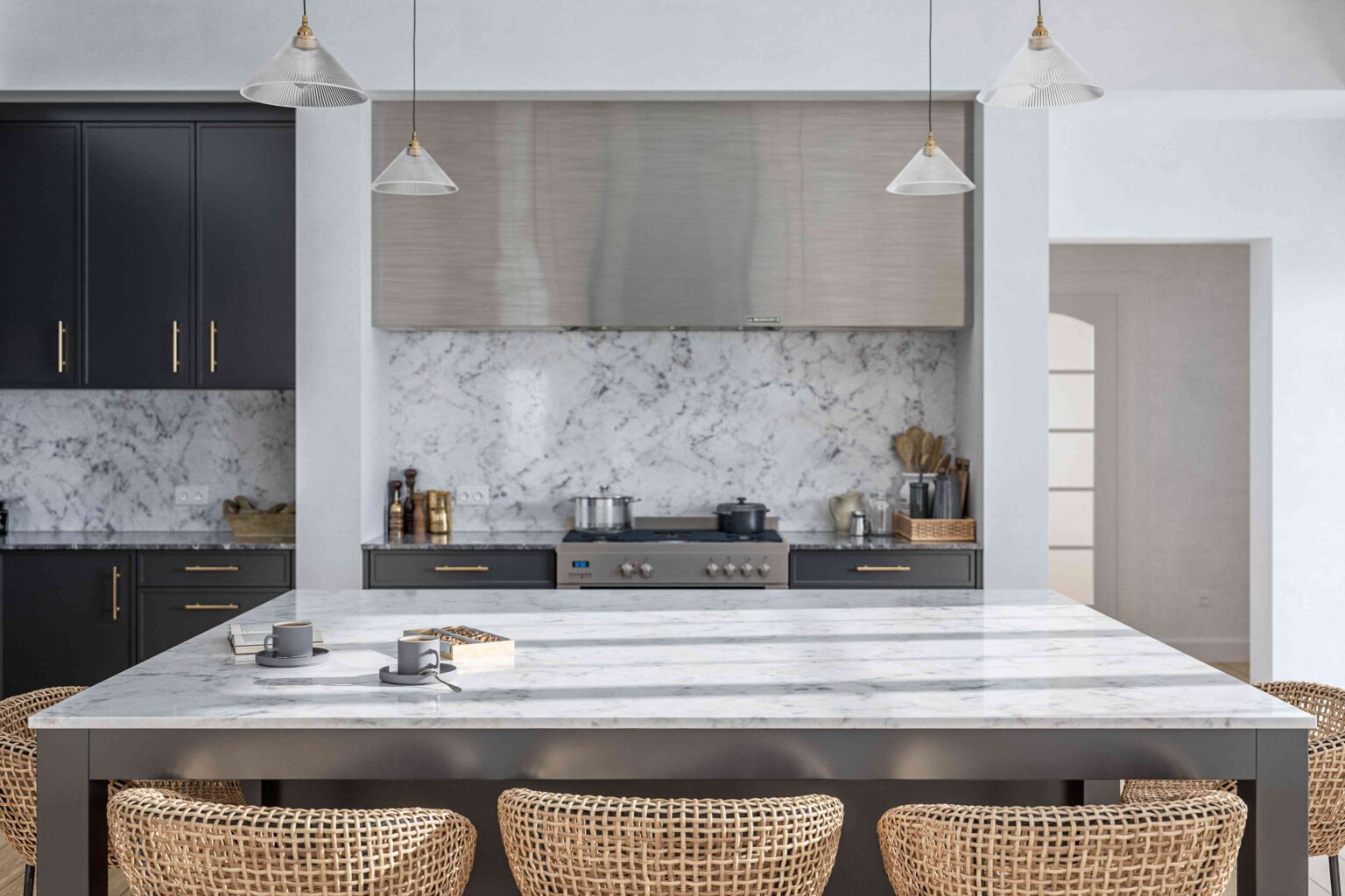
Black and White Kitchens
Black and white is a classic combination for kitchens, but it’s not a hit with all designers. Although Zak Gilby, managing director and cofounder of DeVis Architecture does see its appeal, he’d prefer to skip the maintenance headaches that comes with it.
“White kitchens show every mark and stain, and many ‘durable’ white worktops fall short over time,” says Gilby. “Similarly, black kitchens highlight every scratch and speck of dust, making the space feel smaller unless it’s a large, open-plan room.”
If you still like a big contrasting color combination, Gilby suggest choosing softer creams, beiges, and light greys instead of white, then adding a contrasting accent color, preferably with the appliances.
“For a bolder more creative look, something like sage green or clay with terrazzo finishes can be both modern and inspiring,” Gilby says.
Want more design inspiration? Sign up for our free daily newsletter for the latest decor ideas, designer tips, and more!
Open Shelving in Kitchen
It’s hard to find a designer who would balk at having more shelving in the kitchen—unless it’s open kitchen shelving, that is.
“Open shelving in the kitchen is one design trend that looks beautiful in magazines but not so much in real life,” says Jennifer Jones, principal designer at Niche Interiors. “Since I don’t intend on styling my shelves on the daily, I could never live with this in my own home.”
Gilby likes the look of open shelving, but always prefers to combine it with closed cabinetry. It’s all about cleanliness and organization; cupboard doors keep dust and bugs out. A good rule of thumb is that open shelving should be limited just to items willing to be displayed and dusted regularly.
“If you’re a person who collects mugs or Tupperware, closed storage is a must,” Gilby says.
Wallpaper in a Full Bathroom
Wallpaper is a retro trend that many designers love for transforming the look of a room with relative ease. For some, it depends not on the pattern of the wallpaper, but the location of the wall. And for Jones, wallpaper in a full bathroom is a hard pass.
“Wallpaper and moisture do not mix,” she says. “Stick to wallpapering your powder room.”
Lacquered Flooring
Designers like for their spaces to shine, but some are wary of letting the floors shine too much.
“I get the appeal of bold, lacquered floors, for example a black-and-tan striped foyer,” says Rotem Eylor, CEO and Founder of Republic Floors. “But while I admire the impact, I’d never choose this look for my own home.”
Sometimes, these patterns can be too overwhelming for a smaller space and even clash with other design choices. The constant maintenance required to keep the floor looking its best is also deal breaker for some of these designers.
“Bold floors make a statement, but sometimes less really is more when you’re living with it every day,” Eylor says.
Mirrored Walls
Love it or hate it, mirrored walls are coming back in vogue. While some designers would wax poetic about how the light reflects off those mirrors and makes the room seem much bigger than it is, Gilby disagrees on the most basic level.
“The fingerprints alone are enough to deter me! It’s a no-go for my own home,” he says.
If you’ve got children, you might think otherwise, unless you love the aesthetic of tiny prints on those walls. And if all you’re looking for is more of the illusion of space, go for small, strategically placed mirrors out of reach of little ones.
Small or Mosaic Tiles
Sometimes designers have love-hate relationships with certain elements of home design. Small or mosaic tiles are certainly that for Gilby. An intricate tile installation can look fantastic, but only in the hands of an experienced pro.
“Often, they’re challenging for contractors who aren’t tile specialists, and without that attention to detail, the results can fall flat,” Gilby says.
If you hate scrubbing grout, you’ll want to skip mosaic tiles, too; the smaller the tile, the more grout, the more maintenance needed to keep up the look.
“While a broken tile is easier to replace in mosaic, I’d personally steer clear in my own home—unless I wanted endless conversations with the builder,” he says.
Read the full article here

