


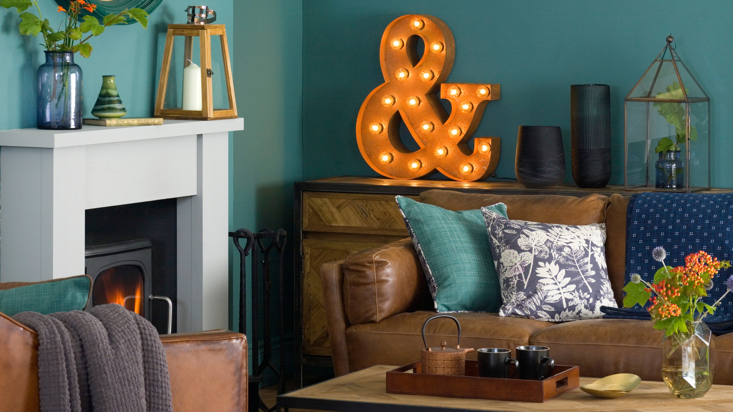
Teal is having a major comeback this year, but before you pick up your paintbrush, you need to ensure you’re pairing this shade with colours that match. And experts have revealed the three colours you should never pair with teal.
One of the most surprising colour trends of 2026 is 2016 colours making a comeback, and that, of course, includes teal. A rich blue-green hue, teal can be beautiful when used properly in your home.
1. Bright, cool reds
‘I would avoid pairing teal with very bright, cool-toned reds. Both colours are intense and highly saturated, and when used together, they tend to compete rather than complement. Instead of feeling layered and considered, the combination can make a scheme feel unsettled and visually disjointed,’ says Holly Lamont, Founder and Creative Director of Holla Design.
Pops of red have been making their way into every stylish home of late, but the red trend isn’t suited to every colour scheme. Where bright or cool reds can feel overwhelming when paired with teal, Holly advises that warmer colours such as ‘muted blush, deep plum, warm neutrals’ can make the space look more balanced.
2. Cool greys
It’s bad news if you plump for grey living room ideas, as, like with bright cool reds, this colour can end up competing with teal to dominate the space.
‘If there is one pairing to approach with caution, I would say cold pure greys. It suddenly creates a metallic harshness to a colour that is lavish and glamorous. It puts the brakes on any life it might offer, and the combination can feel visually tense, as though both colours are competing for the same emotional space. Instead of harmony, you get grumpy friction,’ explains Marianne.
‘That doesn’t mean teal can’t sit with grey at all, but the grey must have warmth, softness or a hint of gold in it to create balance. Colour relationships are about conversations. When two colours don’t speak the same language, they have to work very hard to make themselves heard.’
3. White
While it’s typically true that the best white paint goes with any colour, sometimes it can look too stark when paired with teal. Because of this, it’s best to opt for a warmer neutral colour instead.
‘White – it’s too stark against teal. Avoid anything that creates a strong contrast and fights against the teal. Teal ideally needs to be drenched across walls and woodwork or used with muted tones with red or brown bases to create a lived-in, layered space,’ comments Annika O’Connor, Founder of Fynd Homeware.
‘If you want to brighten the space or use it in a north-facing room, look for a rich, creamy neutral to pair it with.’
If you want to use teal on your walls, opt for a quality paint like Farrow & Ball. While beautifully rich, Vardo also has a brightness to it.
Next
Blue Teal Velvet Ginkgo Duvet Cover and Pillowcase Set
Teal can make your bedroom look instantly luxurious. I love the embroidered featurs of this bedding set for an extra luxe touch.
M&S
Pure Cotton Velvet Fringe Bolster Cushion
One colour that pairs beautifully with teal is orange, as this stunning bolster cushion demonstrates.
Teal is a rich, striking colour that looks beautiful when applied correctly. It can create a majestic, cocooning atmosphere when used to colour-drench a room, while adding teal accents can add richness and depth to a room.
Read the full article here


